
Netwrk
Case Study of Creating the Netwrk Branding, Business Card Design & Packaging Design
Netwrk is an event and community based company that incorporates RFID cards for networking and event attendance.


Sulaksana Sabaratnam
Brand & Identity Developer
Graphic Designer
04/25 - 06/25

Netwrk is a community and event-based company that leverages RFID card technology to streamline networking and event attendance. The brand is focused on creating seamless, modern experiences for event-goers, enabling meaningful connections through smart, tech-integrated solutions.
I led the entire visual identity development, delivering a cohesive and professional brand that reflects Netwrk’s innovative, people-centered mission. From the logo and typography to business card design and custom RFID card packaging, every design decision was made to align with their goal of merging technology and community.
Key Highlights:
-
Complete branding suite including logo design, typography system, and color palette.
-
Branded business cards designed for impact and consistency across networking events.
-
Custom RFID card packaging to enhance the unboxing experience and emphasize professionalism.
-
Visual identity crafted to balance innovation, approachability, and connectivity.
By combining clean, modern aesthetics with strategic brand storytelling, the Netwrk identity supports a cohesive experience across physical and digital touch-points, reinforcing trust, engagement, and ease for event participants.
01 Branding & Identity
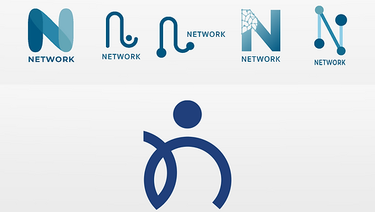
For the logo design, I started by thoroughly understanding the client’s vision, the goals of the company, and the needs of their target audience; professionals attending tech-enabled networking events.
Using these insights, I developed a series of logo concepts that visually communicated themes of connection, innovation, and community. In the very first round of pitches, the client immediately gravitated toward one of the proposed designs, which ultimately became the final logo.
From there, I refined the mark, carefully selecting a color palette and typography that reinforced the brand’s modern, approachable, and professional identity across both digital and physical touchpoints.

02 Business Card Design

The business card design presented a unique challenge, as it needed to be printed directly onto an RFID card, merging form with function. The client provided specific content requirements that had to be clearly and efficiently displayed, including key contact details and branding elements.
Building on the newly finalized logo, I created a custom brand pattern that added a distinctive visual element while maintaining readability and balance. This pattern was integrated into the card’s design to give it a bold, modern flare that aligned with Netwrk’s innovative identity.
The result was a professional yet eye-catching business card that felt cohesive with the overall brand and enhanced the tactile experience of the RFID format.
03 Packaging Design

For the packaging design, the objective was to create a branded box that could securely hold one hundred RFID cards, based on specific measurements provided by the client.
I approached the project with a focus on consistency, ensuring that the packaging aligned seamlessly with the existing visual identity. Using the custom brand pattern developed during the logo and business card phases, I created two distinct design variations. One utilizing the primary colour palette, and the other drawing from the secondary brand colours to introduce visual variety while maintaining cohesion.
Both versions were presented to the client, who appreciated the flexibility and ultimately decided to use both designs interchangeably for different events and internal use.
The final packaging not only reinforced the Netwrk brand but also elevated the unboxing experience with a clean, modern, and memorable presentation.
04 The Takeaway
The biggest takeaway from this project was the power of cohesive branding across multiple touch-points, from logo and business cards to packaging. It reinforced the importance of consistency in visual identity and how small design decisions, like pattern usage or colour variations, can significantly impact the perception and flexibility of a brand.
Collaborating closely with the client and understanding their needs allowed me to deliver designs that were not only visually strong but also functional and adaptable for real-world use.